5 Fonts Every Designer Should Know About
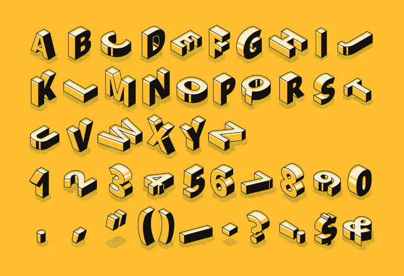
Fonts are more than just letters on a page; they are a designer’s toolkit for visual communication. A well-chosen typeface can transform a brand, enhance readability, and create emotional resonance. Designers need a solid understanding of fonts to ensure their work is both impactful and professional. In today’s competitive market, knowing which typefaces to rely on can make all the difference in creating effective designs.
TT Norms Pro: The Modern Workhorse
Clean and Versatile
TT Norms Pro is a geometric sans serif that has become a favorite among designers for its clarity and flexibility. Its clean lines make it suitable for both digital and print applications, from app interfaces to corporate branding.
See also: 5 Reasons Why You Need Foreclosure Assistance
Complete Font Family
With multiple weights and styles, TT Norms Pro provides consistency across projects. Designers can use the same family for bold headlines, readable body text, and subtle captions, ensuring a cohesive look throughout a brand’s identity.
TT Commons Pro: Balance of Function and Style
Adaptable for Many Uses
TT Commons Pro is a humanist sans serif typeface that combines functionality with elegance. Its balanced proportions and wide character set make it ideal for projects that require both professionalism and personality.
Reliable in Digital Environments
Thanks to careful technical refinement, TT Commons Pro works seamlessly across screens of all sizes. Designers can trust it for web design, app development, and other digital contexts where clarity is key.
TT Hoves: A Bold Statement
Strong and Contemporary
TT Hoves is known for its striking geometric design. With sharp lines and confident structure, it’s perfect for projects that require a bold, modern presence. Designers often turn to this font for branding, advertising, and packaging where attention-grabbing typography is crucial.
Flexible Style Options
The font family includes numerous weights, giving creatives the freedom to experiment with contrast and hierarchy while maintaining a strong, unified style.
TT Interphases Pro: Made for Interfaces
Designed for Digital Use
TT Interphases Pro was developed with digital interfaces in mind. Its optimized shapes and spacing make it highly legible, even at small sizes. This makes it a must-know font for designers working in UI and UX design.
Comprehensive Character Set
With extensive language support and a wide range of symbols, this font ensures accessibility and usability across global projects. It’s not only visually appealing but also technically reliable for complex digital systems.
TT Firs Neue: A Contemporary Sans Serif
Fresh and Minimalist
TT Firs Neue is a modern sans serif typeface that embodies simplicity and freshness. Its minimalist design makes it suitable for editorial layouts, posters, and digital platforms where clean typography enhances the overall look.
Great for Branding
This typeface offers a stylish yet approachable personality, making it a strong choice for companies that want to appear modern and forward-thinking without sacrificing professionalism.
Why These Fonts Stand Out
Professional Craftsmanship
Each of these fonts is part of a carefully developed collection, crafted with attention to both artistic design and technical quality. They have been tested for readability, consistency, and adaptability across different platforms and uses.
Wide Range of Applications
From bold advertising campaigns to precise user interface designs, these fonts give designers the flexibility to handle diverse projects while maintaining professional results.
Complete Families for Consistency
All five typefaces come with full families, including multiple weights and styles. This allows designers to build cohesive visual identities without needing to combine unrelated fonts.
Conclusion
For designers, mastering the right fonts is as important as mastering color theory or composition. TT Norms Pro, TT Commons Pro, TT Hoves, TT Interphases Pro, and TT Firs Neue represent five typefaces every designer should know about. Each offers a blend of versatility, technical reliability, and aesthetic appeal. By incorporating these fonts into their toolkit, designers can create projects that are visually compelling, brand-consistent, and tailored for both print and digital platforms.